Sunday, 31 October 2010

Project Report

Here is my illustrated project report on my own individual tasks which I did in each of the following: Research, Planning, Production, Feedback, Evaluation.

Project Report

Research/Planning:
In this project I have found out my own research about the history of hooliganism, I found some fonts which we could have used for our final webisode. I also created the treatment for our websiode which leads up to the pitch and talked about what the idea was and what it was based around. This is all visible to see in my sketchbook or on my blog. I did the pitch document as well, and on this included the 'Synopsis', 'Rationale' and the 'Contingency plan'. I inked over the storyboard and made some images in more detail, I found out about hooligan clothing.

Production:
Within the production of our final webisode I like to see myself as being the person who came up with the editing ideas and although I didn't handle the editing as much I put as much imput into everything as the person I worked with. This was a major joint effort, but we separately came up with ideas, and agreed or disagreed on what we thought looked best in the footage until we came up with the best solution as a joint decision. There was much more to the production such as camerawork which I took control of and I also took a little acting role. I made some of the sound effects and found the music for the webisode.

Feedback:
I created a facebook group where people could leave any feedback on our webisode. This group was all about our webisode and I updated it any time we did something new, so that the target audience that were interested could see what we had done, and how far we had made it. So I took control on this. We also had a website where I posted a few things onto as well.In my sketchbook I have put down all of the feedback which people have given us.

Evaluation:
There were four seperate parts to the evaluation so we shared it out so we both did two parts of it each. I did the 'Resourses' part where I had to list and get pictures of everything we had used throughout the project and also I named the price for each resourse, which was difficult to find out, but I got everything that I needed to get down, into it.The scond part which I did was the 'Cast and Crew' section where I had to create a model release form for each of the actors and they all had to sign it, or if they were under the age of 18 they had to get their parents to sign it for them.

Conclusion:
I feel that I have had my fair part in this project and as a whole have come a long way from just having an idea, to actually creating it, adding all the little things that make it much better, like the sound effects and visual effects. I think that I have done a very good job in this project as an individual, and 'we' have done a very good job as a team.

Wednesday, 20 October 2010

Resources

Here is my resource list which I created in photoshop. I put down a list of the things we used and the prices of which they come to. I also have pictures of what was used as well just incase people don't know what things are.


As you can see there are some things which doesn't have a budget like, facebook, but other things like the make-up and the tripod costs.

Tuesday, 19 October 2010

Todays Action Plan (19/10/10)

The first thing which we are planning to do is to continue with the white sheet. On the white sheet are a load of tasks which we need to get completed individually and some by working together. We need to work together to do the focus group and also look at audience feedback to put into our group production bible folder. Once we have the focus group organised and completed we will then upload the footage and edit it, we will then write up the transcript of the interviews.

If we finish the sheet and have enough time, we will then start on the yellow sheet which is to be done in groups. The tasks state that we need to get scouting reports for our locations, and we have pictures. Another task is to get model release forms for the cast and crew to sign. Then there is resources which shows what equipment we used and alternative uses. Finally we have the legalities to do which is the health and safety part, where we need to complete a risk assessment for each shoot.

If we do not get this part done by today then we will definitely do it by tomorrow.

Monday, 18 October 2010

Comparing roughcut to finished video

Here is the roughcut version of 'The North Stand'

Here is the final version of 'The North Stand'

As you can see both of the copies are very different to each other and there is a significant change between them both. I am going to go through all the changes in this post.

Sound:
When watching the roughcut version you can hear all the natural sounds, so when the shots change the background noise changes and it doesn't flow very well, also this makes the fighting look less realistic because there is no noise when the punching and kicking happens because there is no sound effects. Whereas in the final version everything flows because we found some natural sound so when he is walking you can hear the same sound which runs through to the next shot. Also we dubbed over the speech where the two friends meet at college because the sound wasn't flowing well at all, but now it does. The fight scene also now looks very realistic because we went out and created our own punching/kicking noises. There is also now a voiceover.

Music:
The music in the roughcut is no longer in the final version because we though that it was too soft and calm music, so we found some quite heavy house music, similar to the music in football factory. This music continues to play through the opening sequence and drowns out towards the fight scene. Once the fight scene is over, we introduce some new music, which is a rock type song. I chose this because I thought that it fits in the fight scene and also when the credits come up this is the type of music that makes it look even better. In the roughcut there is no music at the end because we didn't have time to.

Visual Effects:
There have been many changes in visual effects from our roughcut to our final version of the webisode. In the final version we have added special effects like posterize for the beginning of the sequence and we have also used a staged live action to a staggered rotor scoping effect, which takes you from one place to another by transforming a still image. This effect works because in the roughcut version he is in one place and then in the next shot he is at college, but now we have that effect in place it makes it more believable and not so rushed. We have also made some really nice sharp cuts in certain places which makes evrything look fast pace and also as if it is an actual real fight going on. There is none of this happening in the roughcut version. We still have the cuts where he gets kicked in the face when he's on the floor and it goes in and out of black when he gets hit which was also seen in the roughcut version. On the roughcut draft we had gaps that needed to be filled and we found a way to fill them in which we made by using title sequences. The main title sequence which display the name of the webisode appears in the part where it fades into him telling the whole story. The roughcut only showed the fade and people got confused by what was happening, but now with the title it is more understood that this is the part where he is explaining what happend.

Conclusion:
I personally think that me and Louis have come a long way from our roughcut and have turned it into a really watchable football hooligan webisode.

Monday, 11 October 2010

Action plan for editing webisode

We have now finished all of the footage needed for our webisode and me and Louis have got some good ideas to make our football hooligan type webisode look really cool. Now we have our rough cut version sorted and uploaded we now need to take the feedback we got from the class and make our webisode top quality.

Our ideas for tomorrows lesson is to continue with the editing and hopefully finish it by the end of the day. Some of the feedback suggested that we needed to dub some speach over some talking because all you can hear is the natural sounds like the wind and buses.

We will have to play around with the soundtrack as well because the tempo and volume doesn't fit very well with the webisode at the moment. We have put in all the shots we want, we now just need to make some good effects and add them on to it. Such as slow motion, fades, blackouts. Another thing we need to do is make a dramatic fade so that when people are watching it they can tell that the fight scene is a story that he is telling and not just him suddenly wearing a different outfit. In the lesson tomorrow we will also be adding narrative to go over the top of some parts and also titles. We have both decided and agreed where we want to put the titles, and have got the greatest spot to put the main title 'The North Stand' in.

Some of the effects that we are planning to use in our opening part of the sequence is the notebook effect and also put a gausin effect over the top of it to make it look black and white with a rough effect on it. There has been an extension on the beginning of our webisode in the title sequence. On this part we will use the notebook/gausin effect and we also have some freeze frames for it as well. There are shots of a police man walking away which I think works well and also will hopefully help people understand it more.

Tuesday, 5 October 2010

Todays Plan (5th Oct)

My plans for today changed as the original plan was to finish the animatic and update my sketchbook, but as we had the opportunity to use the camera we decided that we should film instead. So we made our way down to the grafton to find a suitable location, which were flats. When we got all of our shots we came back to college and uploaded everything to final cut. We have now started to edit the shots which we took today.

Hooligan Clothing (Brands)

I have found some clothing which I think fits the genre of football hooliganism and this is what we want the actors in our webisode to be wearing. There are such brands as Fred Perry, Lacoste, Ralph lauren etc that we are hoping to use for the characters.


Thursday, 30 September 2010

Fonts for my webisode

Here are some fonts which I have looked at and think will be suitable for my webisode based on football hooliganism. I am aiming to use one of these fonts for my final webisode piece.

Tuesday, 28 September 2010

Monday, 27 September 2010

My Pitch document

This is my pitch document for my genre project. I have described the story in an understandable way, the rationale shows research that I have picked up from the market audience, and the contingency plan shows some of the issues we may face. I think that the pitch document has enough information to know what we will be getting up to when finding locations and so on.

Friday, 24 September 2010

Keynote

Here is mine and Louis keynote which I think gets across the main points we wanted people to know about. I think that our keynote is small but we didn't get to finish it in as much detail as we wanted to as we were trying to concentrate on many other things.

Thursday, 23 September 2010

Book Reference for Football Hooligans

This book is called 'Football Hooligans' and in this section of the book I found a quote about teen hooligans, which is helpful as I am doing a webisode about teen hooligans.


Footbal Hooligans - The firm

This is the opening sequence to the 1988 film 'The Firm' this is the sort thing me and Louis are hoping to achieve, but obviously not with the car. We will use fake props i.e blood, baseball bats and bricks to accomplish what we need.

Monday, 20 September 2010

SWOT analysis - main idea (Football Hooligans)

Here is my SWOT analysis for mine and Louis idea of football hooligans. SWOT meaning Strengths, Weaknesses, Opportunities, and Threats.


Sunday, 19 September 2010

Genre project 1st review

I so far think that the genre project has gone quite well for me in my sketchbook as i have six genre ideas which I have researched on and I have now Come down to two genres which I am happy with.

The two genres which I have narrowed it down to, are comedy, where I have researched a lot about Laurel and Hardy and Kenen and Kel. I have also chosen to do Action genre where I am going to work with Louis on to do a football hooligan scenario.

So overall I am happy with the stage I am at and I think that the plan me and Louis have decided to do will work, to make a good football hooligan webisode.

Friday, 17 September 2010

Laurel and Hardy Comedy (old and newer films)

In this post I am going to have some videos on old and newer Laurel and Hardy comedy films.

I have found some of the greatest Laurel and Hardy footage without any sound apart from the music and effects they played over the top here is one of the videos: (1920's)

This is another of Laurel and Hardy footage which I have found, but in this footage it has evolved in the way that there is actual sound of the two characters talking. Instead of the music playing loudly as it did before, you can just hear it in the background slightly: (1930's)

This is the latest footage of Laurel and Hardy in colour, as you can see there was a lot of change in Laurel and Hardy comedy, from no sound, to sound, and then finally to colour and sound. This shows that Laurel and Hardy have evolved a lot over the years it was produced: (late 1930's)

Wednesday, 15 September 2010

Origins of comedy genre

I found a website which defined the origins of comedy. I think that this website has a lot of good information if your trying to find out what the background of comedy is, and where it all started. I found out that a greek poet called 'Susarion' was the first comic poet or the earliest that was recorded. On this site it also explains that the origins of the comedy genre started with the greeks (Greek comedy).


Tuesday, 14 September 2010

Origins of Dance movies (research)

I found a website which has information on the origins of dance movies from 1948-2008. The website is called DanceHelp.com and it hasn't got everything up to date but it still gives a list of dance movies which I didn't even know about.

I also looked on wikipedia to see if that could help me in my search to find out about the history and origins of dance movies and I found a part which is called Dance in film. On this site I came across quite a lot of things. There was one film which was produced in 1948 called the 'Red Shoes', which is a ballet film, and this links to a lot of older films which are mainly all ballet films, but a massive change has occurred nowadays in which most films are all about street dancing and dancing competitions and there is always romance in mainly all recent dance films. In newer films/2000's films like 'you got served' this is where the street dancing competitions start to become popular in a range of dance films. A fairly new dance film called 'Dance Flick' has taken a different approach in which they still keep the street dance side to it, but with a comedy twist.

Red Shoes trailer:(1948)


You got served trailer:(2004)


Dance Flick Trailer:(2009)

Monday, 13 September 2010

Interview with a vampire and Original Buffy

Here are the trailers from 'interview with a vampire' and the 'original Buffy' the vampire slayer film which I have embeded off youtube.

Interview with a vampire:


Original Buffy the vampire slayer:

Vampire and Dance film trailers

I have found two trailers which relate to the title of my post, one is called drakula 'a vampire film' and the other is 'You got served'. I havn't seen drakula before but the trailer tells me that its supposed to be a fast paced horror film. The music suggests this aswell.
The second trailer 'You got served ' is my all time favourite dance film. it is all to do with break dancing and body popping competitions. The trailer music makes yoyu understand which audience its searching for 'younger audience' and in this film there is also romance aswell. There is also something the main characters grouphas to get passed which is another good group which causes conflict and causes the group to loose hope and fall out, but like in any film with this sort of attitude and tempo, things start to change and people start to become friends again. By the end of it everything is back to normal, but better.

Vampire film: (Drakula)


Dance Film: (You got served)

80's vs 2000's Dance film genre's

In todays lesson we had a look at two different film genres which included vampires with films such as Twilight and The lost boys and two dance films such as Flashdance and Step up. For the post I have decided I am going to talk about both flashdance and Step up.
Here is the trailer for Flashdance: (1983)


Here is the trailer for Step up: (2006)


Both films are about people wanting to dance, but they take a different path in showing this. I n the trailer for flashdance it starts off with the main character 'Alex' a girl who is describing how dancing makes her feel. Her style of dance is Ballete. There is a narrator who speaks over the trailer saying what she wants. Whereas in Step up it starts with one of the main characters in his court case getting sentenced to community service, his style of dance is break dancing, so you can already see the differences between the two. It then shows the other main character 'girl' who is looking for a dance partner and she does ballete, so there is a link to the Flashdance character with this person.

In the trailer for Flashdance it says she is a "woman living in a mans world" and chasing her "dream" which is dancing. Similarly in Step up the girl is chasing her dream, but she needs help doing it. Both stories have a romance in them aswell, as the woman in both fall in love with a man, in Step up this being the other main character. The music for both trailers are very different for each other, as in the 80's Flashdance trailer it is very pop styled, but in the 2000's film Step up it is very hip hop.

Book cover design task

This image below is where I got the idea from for doing my book cover, I chose this because I thought it looked simple but also I think it is quite funny. In my book cover I replaced the face book with the book title by using the magic wond photoshop tool.


Here is my first draft of my book cover, I think that it is quite funny by using the coffin, but I do think that it needs many changes to it which I will work on. I am going to move a few things around and ajust the sizes to certain things.


This is my final draft of my book cover design which I have made quite a lot of changes to by moving things around. I still decided to keep everything that I had in it before still in it but I have still made some major changes to it. The 'CM' logo is still in the top left corner, but everything else is either resized or moved to a different spot. After the feedback in class, I decided to go with what everyone was saying and decided to move the coffin with the writing down to the bottom, move the quote nearer to the top and resize it so that it is smaller and the last thing I did was make the authors name smaller so that you would have more chance of noticing the title name which is in the coffin, instead of just looking straight at the author text. I think that this style works much more than the origonal style which I had because eveything has been replaced and resized making the whole book profile image stand out more.

Wednesday, 8 September 2010

Google Usage rights

I looked on google and found out about the usage rights. Here is a screengrab of the usage rights which I have taken:


Book cover research

I have researched some book cover designs to do with crime and comedy and I have found some which I think will appeal to a younger audience but still have a formal look to them.


These are all crime/comedy type books:

I found this book cover on amazon by looking through the crime and comedy section. I particularly like the red sky with the buildings that looks like a nice silhouette. The blue ground which makes it look more like a gaming cover also caught my eye.


This is also a book which I found via amazon, I chose this one because I thought the book cover with the cow looked quite funny but the text is formal. I also think that the colours look nice and bright and would fit perfectly with a younger audience.


The reason for me choosing this book cover is because the writing in the white box and the blue background makes it look quite formal, but the thing that catches the audiences eye the most on this book cover is the animated funny pictures in the foreground. I looked at this and straight away I saw the stars, the dog and the string of sausages. I found this book cover when looking on Amazon.

Tuesday, 7 September 2010

Genre Moodboard images (Horror)

Here are some images of the horror genre in different types of media's:

Horror Tv series: The vampire diaries


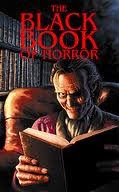
Horror book: The black book of horror


Horror game: Dead rising


Horror film: Saw


Monday, 6 September 2010

My favourite type of music genre

My favourite music genre has changed very recently since I was in Jamaica. I used to prefer RnB, Grime and normal Reggae, but when I was in Jamaica, out at night and even during the day they played a different style of Reggae on a sound system which I really enjoyed listening to. This reggea style is called Reggea Dancehall.

I find it enjoyable and relaxing but all so something you can dance and sing to. Since coming back from Jamaica I have been listening to this type of music genre almost everyday and it is the most popular music genre out in the Jamaica at this present time. So my favourite genre in music is REGGAE DANCEHALL.

Saturday, 4 September 2010

Two types of canvas stretching styles

There are two different types of canvas stretching styles and I have done both of the styles over the weekend. I am now going to show you the different styles with their names and with a short explanation of how they're different.

Gallery: This is the style which I done for my first ever canvas stretch and below is a picture of me holding a gallery canvas style. Gallery is when the picture is only shown on the front of the canvas leaving the edging white (the colour of the canvas).

Wrapped: This style is different to gallery because the picture surrounds the whole canvas so there is no blank part of the canvas, and the picture is around the sides of the canvas aswell so it wrapped round the frame. Below is a picture of me holding a wrapped canvas.

Practise (Canvas Stretching)

Over the weekend I have been practising stretching canvas and i think that overall I have done a very good job considering it was my first time ever doing it. My dad told me what to do but as a challenge he wasn't properly showing me how to do it, he would just say if im doing it wrong and then I would have to figure out by looking at the pieces how to do it.

Here are a few pictures with explanation of what I am doing:

Pic 1: In this photo I am beginning to make the frame with the four pieces of wood.

Pic 2: Again, I am putting together the frame by fitting the gaps in the wood together.

Pic 3: In this phot I am making sure that the frame is straight and not at all wonky, so I am ding this by pushing the wood tightly.

Pic 4: Here you cansee that I am making sure the photo is on the frame properly, so that there are no odd bits showing.

Pic 5: I am stapling the picture to the frame so that it can't move around when I turn it back over.

Pic 6: Because the picture wasn't absolutely straight I had to use a canvas stretcher (as you can see in my hand) and pull the picure round until I could just see the edge ofthe photo coming round the side of the frame.

Pic 7: Here is the finished product with all of the equipmeny I used along he way. I am pleased wit my final work as it is a practise and my first ever go.

Wednesday, 1 September 2010

Reseach on (How to stretch canvas)

Here is a video which I found on youtube, of how to stretch canvas:


I also looked on another site called SearchWarp where I found out this information, which I then changed into my own words:

1. First off all you should make sure you have the correct sized canvas for your piece. It is extremely important that you know the size of your canvas. The canvas size is a major part when it comes to choosing the size of stretcher strips that you need for your frames. Stretcher strips can be found at art and crafts shops.

2. Check the shape of the frame and make sure that it is very square. To find out the squareness of the frame, you need to measure across the diagonal corners. Doing this means you can be sure that the measurements are exactly equal.

3. Frame the canvas. Put the canvas over a stretcher frame. Do not push down to hard, and try to do it lightly pushing down all the corners. Don’t use stretcher frames that have sharpend edges as it can ruin the print.

4. Attach the canvas. Stick the print onto the canvas frame using canvas stretching pliers. The best way to do this is by starting in the center of the stretcher frame and then gradually work your way out towards the edges.

5. Assure that you avoid spraying. Do not spray any water or any kind of substancethat can cause any damage to the print. Put the stretched canvas on places that are not exposed to any direct sunlight as this can also be bad for the print.

On the whole, you should be very careful when stretching and holding the canvas prints. There are many ways on how to stretch canvas and make different compositions with the frame itself. Any careless handling of the canvas can and most probably will result to the ruin of the entire print. So if you want a nice long-lasting photographic quality print on canvas, it is best to keep all five of the tips above in mind.

Friday, 27 August 2010

2nd Biography - Moonwalker - Michael Jackson

Published by: Arrow Books 2010
Author: Michael Jackson
Date: 1988 (original) 2009 (new)
Published in: London

Top 5 tips from this biography:

1.

2.

3.

4.

5.

Monday, 23 August 2010

1st Biography: Jeremy Clarkson - Driven to distraction

Published by: Penguin Group
Author: Jeremy Clarkson
Date: 2010
Published in: London (penguin books LTD)

Top five tips from this biography:

1. As soon as I opened the book on page zero I saw a quote from Jeremy which said "To everyone who made my Range Rover, well done , Chaps. It's brilliant." I find this interesting because as soon as you open the book this appears in your face. I think this shows us that Jeremy is a very thankful person which has helped him to progress into his career.

2. Page number 50 "What exactly is a womans point of view when it comes to cars..." this shows me that he is thinking about womens needs in cars andnot just males who are stereotyped as driving fast, I suppose like he does.

3. On page 55 he says "Top gears back on television tonight with a whole new look..." this is making sure people remember about his programme, which is almost like advertising in his book. He then carries on by saying "..we thought up of new ways to keep BBC2's most popular car show fresh and entertaining" When he says this I feel as though he wants people to believe and feel that it is going to be bigger and better than ever.

4. On page 245 he makes an interesting point which probably helped him along his way and is probably why he is a successful person "Often im relieved to climb out of a lambourghini and into a nissan micra because in my world change is the adrenaline rush." I think of this as being a baseline to success because it shows that he likes change and experiments with different cars and not just stick to the same one.

5. He seems to know alot about what he is talking about, which shows he researches alot on page 336-337 you can see this, "Not that long ago mercades announced they were going to extend their range of saloons and estates to make something for everyone..." This quote shows that he loves to look into things that most people wouldnt know about.

Tuesday, 17 August 2010

Research on how to stretch canvas

I found some information on how to stretch canvas on this site: About.com

This site tells you how to stretch canvas and the equipment you need to do it with, also it tells you detailed facts like how you should put the nails opposite each other when stretching.


I found this site to be very useful in my research and will continue to publish more sites which I have researched to help me at a later date.


Tuesday, 3 August 2010

Powerpoint of my idea

Here is my powerpoint for my final idea for the extended project. I have responses showing what I will be doing throughout my project, and I have images showing the types of things I will be using and needing.


Slide 2: In this slide it shows the printer and canvas, I have this printer at my dads house so he will show me how to use it properly. I will have to shorten the amount of canvas I produce because it costs quite a lot of money.

Slide 3: This slide explains my idea and what sort of pictures I am hoping to take for my canvas.

Slide 4: This slide explains how I want to develop my idea. As explained I want to have a variety of canvas sizes. This may be quite difficult ascanvas is expensive.

Slide 5: In this slide it shows how you stretch canvas which I will get my dad to teach me. I think that this will be very fun and interesting to do.

Slide 6: On this slide it shows a quick example of the equipment that is needed to stretch canvas.

Slide 7: The next slide asks the question "where is the project at now?" and I have explained that I am going to do around 5 canvases, but I have now changed my idea and I will only be doing 1-3 canvas stretches.

Slide 8: The next slide asks the question "What next", well, the next stage originally was to create one big picture from around five different canvases, but I think this idea is to complex and also I wont be funded enough to stretch five canvases.

Tuesday, 13 July 2010

Snooker fox (Banksy style)

Below is my recreation of a Banksy styled stencil art piece which I edited on photoshop. It is a fox playing pool, I got this idea from the position of what the fox is in with its paws making it look like it should be holding a pool cue. I changed the opacity on parts of it aswell, for example, on the window. You can also see the bricks and the glass through the fox.

BANKSY

Banksy is a well known british street artist and is most known for his work with stencils. He is also a person he is very secretive which shows, as he has made sure that he has a hidden identity.


This is an example for one of Banksy's stencil art works. I chose this one because I like what he has done with this art work, as you would expect the flowers to be a molotov. The stencil work is amazing and really caught my eye.